New Philadelphia 76ers Logo Revealed?
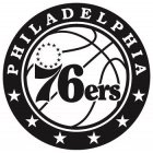
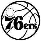
New 76ers logos have appeared in the United States Trademark Electronic Search System (TESS), leading to speculation that they could be the 76ers new logo, which is expected to be announced today.
The first two logos contain the same core section, which is very similar to 76ers current logo. They have a slightly modified basketball (rotated slightly off center) being the main difference from the current 76ers logo. The second logo then adds “Philadelphia” wording around the top of the basketball, with 6 stars on the bottom.
Here is the 76ers current logo:
There were two more trademarks filed, which seem to be auxiliary logos.
All trademarks were filed on May 7th.
Note: while the trademark filings show a black and white logo, that does not mean the logos will be black and white when they’re actually used. It is common practice for trademark filings to be submitted in black and white.
From the USPTO’s website:
“Unless a color image is being submitted for a mark wherein color is claimed as a feature of the mark, the mark image should be black and white.”
Update: 9:30 am – in color
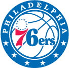
The new 76ers logo looks to be virtually verified, as nba.com has already started using it. Here it is in color:
Update: 9:34 am – Updated jersey details
According to Sixers CEO Scott O’Neil, the 76ers will introduce the new logos on June 18th at the Wells Fargo Center. The event will be open to the public, free of charge.
Update: 9:40 am – Confirmation
The 76ers have sent out a press release on the new logos, describing their function.
From the press release:
PHILADELPHIA, PA – MAY 12, 2015 – The Philadelphia 76ers today unveiled an updated brand identity, which includes a redesigned primary logo and a series of partial and secondary logo variations in advance of the NBA Draft Lottery on Tuesday, May 19 and the introduction of new uniforms on Thursday, June 18.
The logo set is effective immediately and updates the iconic Sixers design through the incorporation of new and traditionally significant elements:
The team’s new primary logo is a modern interpretation of the classic Sixers insignia, stylistically redeveloped to include a patriotic blue border with six white stars and “PHILADELPHIA” adorned across the heading. The familiar white basketball has been visually updated with a positional rotation of the seams. The emblematic ring of 13 stars present in the primary, partial and secondary logos continues to represent the original American Colonies.
The introduction of the new logos tips off the launch of an updated visual identity for the Sixers, highlighted by new uniforms for the 2015-16 season. The uniforms will debut on June 18 at a public event held from 7:00-8:30 p.m. at the Wells Fargo Center (3601 S Broad St, Philadelphia, PA 19148), where attendees will be treated to a series of dynamic digital displays and interactive elements. Sixers legends Billy Cunningham, Darryl Dawkins, Moses Malone, Bobby Jones and Allen Iverson and special guest Barbara Chamberlain-Lewis, sister of the late Wilt Chamberlain, are scheduled to attend, as well as current Sixers players.
Related Posts
-
Cristián Estibill
-
tk76
-
AaronMcKie4MVP
-
John Magee
-
The Greek


